Year
2022 & 2023 & 2024
Deliverables
- Website design
- Website development (WordPress)
- UX design
- UX writing
Link
Please note: the original design might have changed due to the client’s own modifications.
Finland’s largest craft beer festival’s website got a redesign as fresh as its beers.
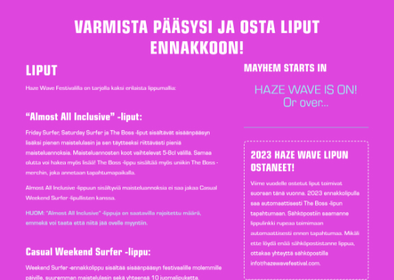
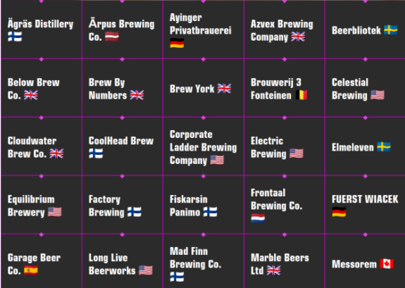
A spontaneous usability evaluation of the festival’s website turned into a full redesign and renewal project, that is refreshed yearly. As bright and quirky as the festival itself, the website redesign captures the spirit of the event, utilizing their pre-existing color palettes and graphics. The redesign was especially complimented for it’s ease of use and modern looks.
”Working with Claudio was wonderfully direct ... 100% full support!
Erkki Häme, Co-Founder & CEO
Overview
My extensive background and involment in the craft beer scene made this a particularly interesting project for me. In the redesign of the HWF website, I seeked to embody the spirit of the scene and the festival in order to hint the users what it’s all about. Colorful and creative, yet minimalistic and user-friendly.
Starting point
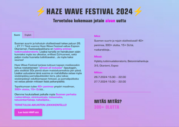
The original website had a good thing going on. However, there were major issues with color contrasts, visual hierarchy and usability that needed fixing. Instead of just fixing the major issues, the whole website was redesigned.
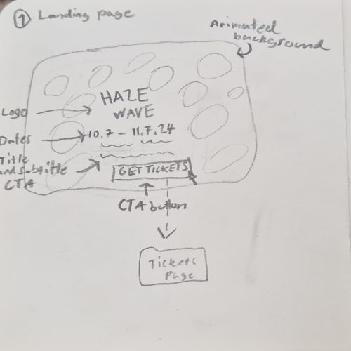
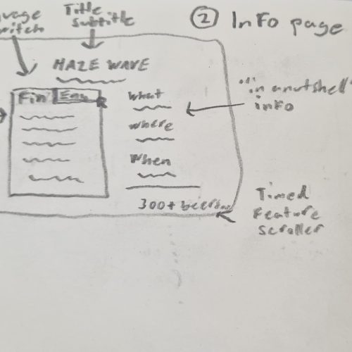
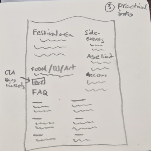
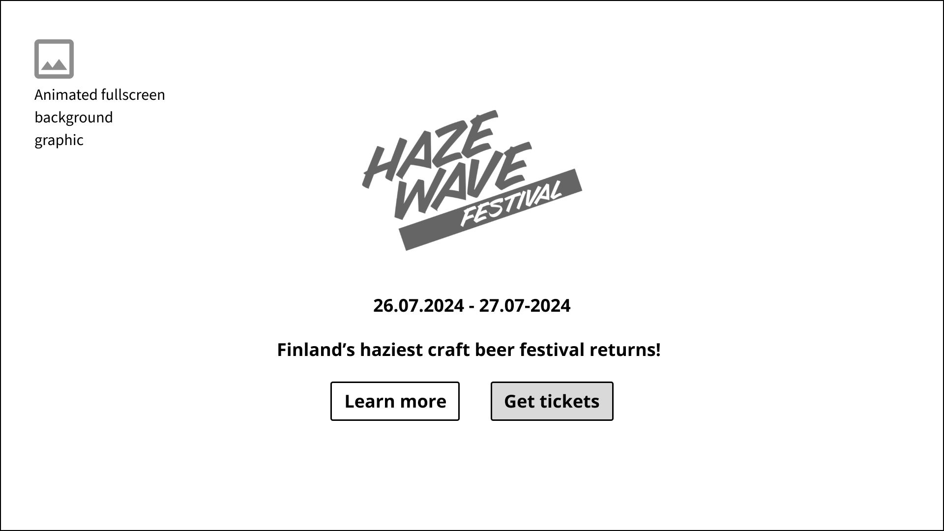
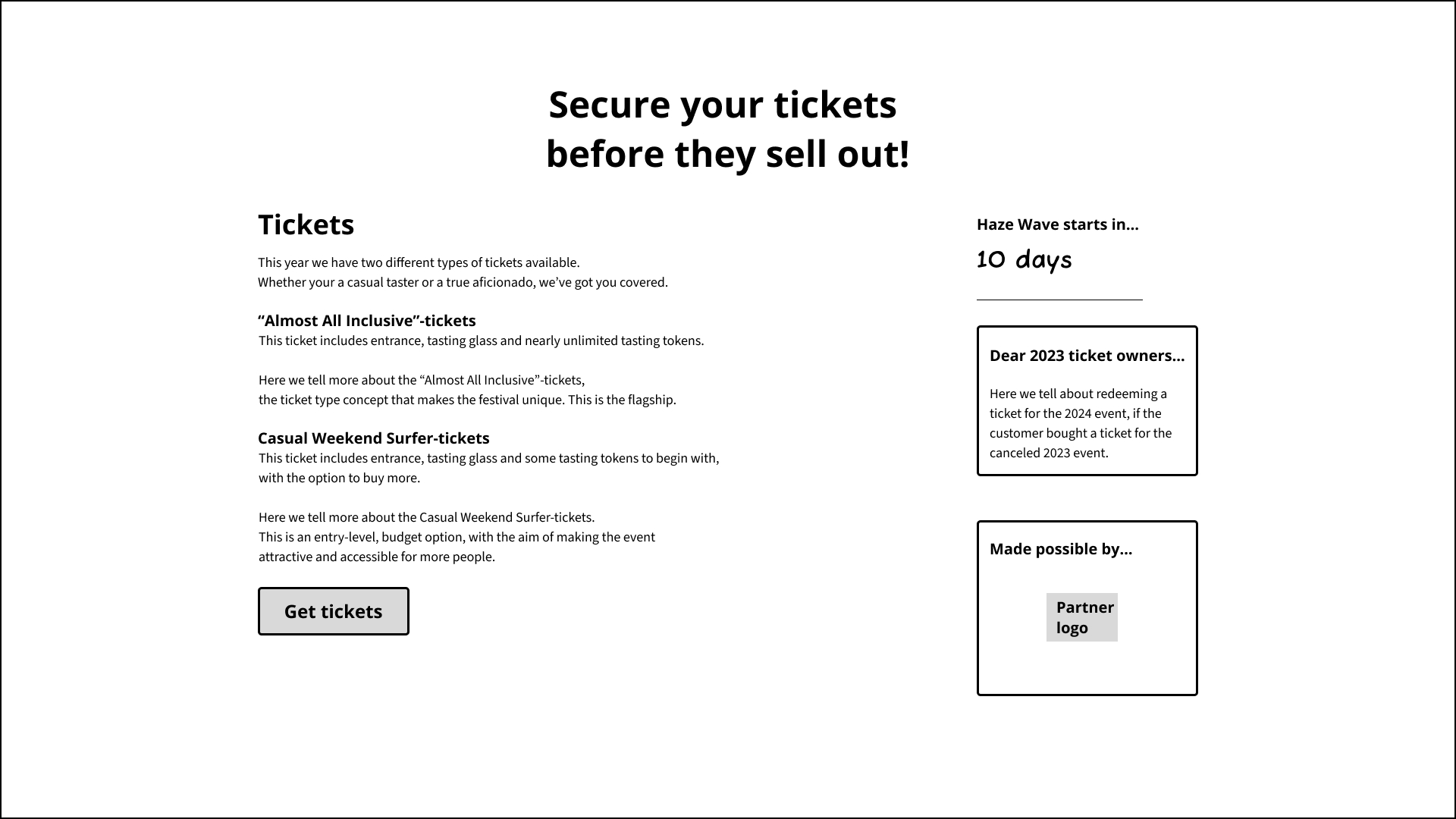
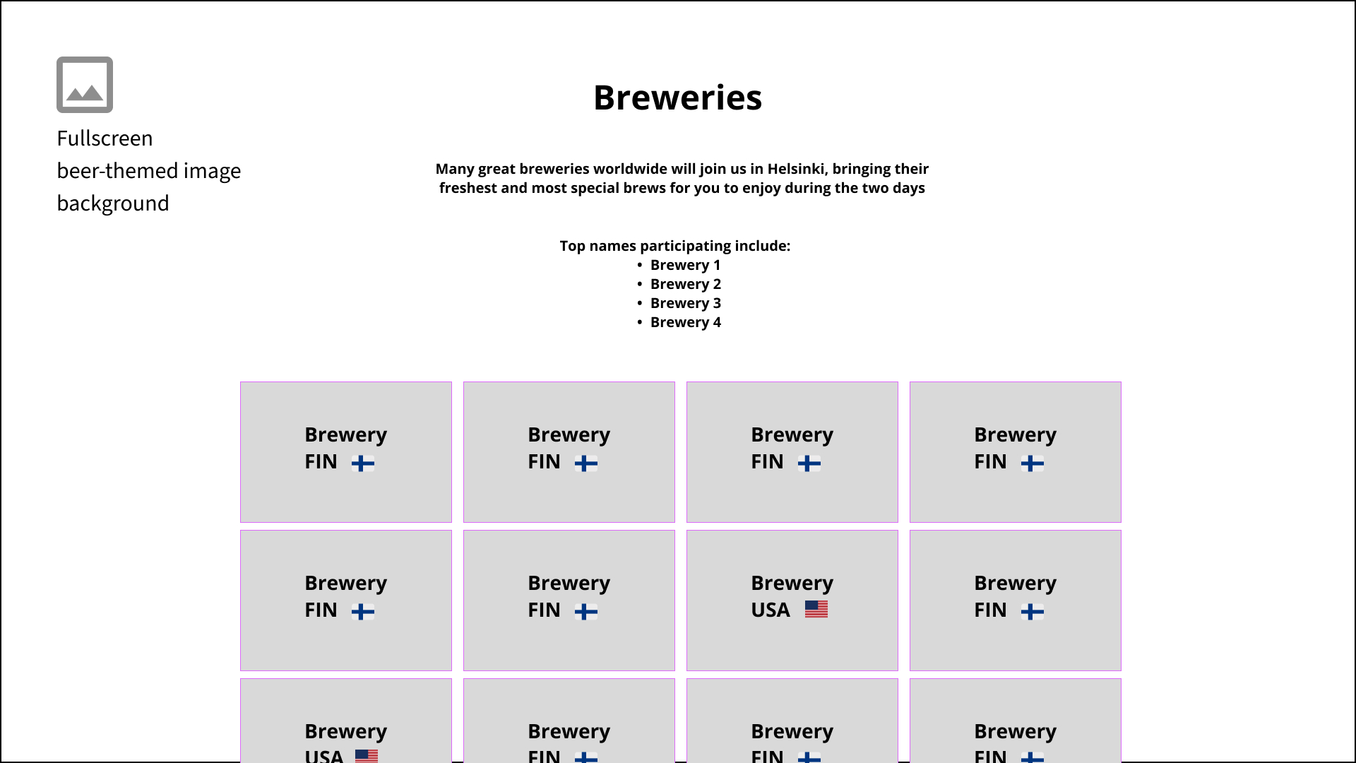
Sketching | Low-fidelity wireframe
The aim was a minimalistic, user-friendly experience, which provides information about the event and encourages visitors to buy tickets to the event. In close collaboration with the client and users, the sketches were revised until everyone was satisfied with the overall idea.
Final results
The resulting end product was a fresh and colorful UI, with an intuitive UX that is clutter-free and accessible. The website both gives information about the event and encourages users to buy tickets.
“Working with Claudio was wonderfully direct - he got the job done quickly and was brave to come up with different creative implementation options and ideas. He worked very quickly and flexibly, even in the face of a tight deadline. We got exactly what we wanted - and much more! 100% full support!”
Erkki Häme, Co-Founder & CEO
