Rihma
Prompting Unexpected, Unbiased Encounters
Year
2022
Deliverables
- Mobile application
- UX Design
- UI Design
- Service Design
Project draft link
Rihma project on Figma {ADD LINK}
Stripping friend-making of biases by allowing unexpected encounters.
Loneliness is poison¹ . Several services have tried to facilitate finding friends, with or without benefits. Yet in many of them, the matchmaking is based on external factors such as the person’s appearance, and people tend to mingle with humans similar to them. Thus intergenerational and intergroup mingling remains rare.
With my team, we wanted to change that. Thus we created a service that allows debiased, unexpected encounters, where the only criteria is a common interest in an activity.
Overview
“This project tested my skills of interdisciplinary work and project management. Our team of two graphic designers, a photographer, and me, a service designer, was versatile and creative, and it can be seen in the end result. The pitch, delivered with a touch of humor, was the cherry on the cake.”
Thoughts on the process
Market research
Forecast
The Social Networking app market has been growing exponentially for the past few decades. In 2022 it was valued at $49.09bn. It is expected to grow with an annual rate of 17.09% 26.2% from 2023 to 2030(¹,²). Although competed, the market is thus growing at a rapid rate and there is potential for successful newcomers.
Issue
In the vast sea of Social Networking apps, there are few that reduce bias from matchmaking. This can potentially exclude certain user groups, who would benefit from meeting new people outside of their regular circles.


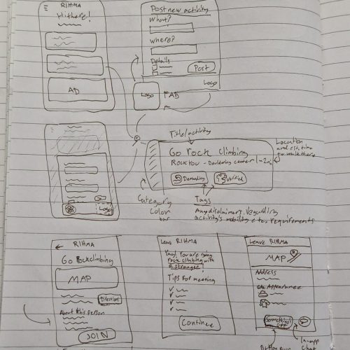
Sketching | Low-fidelity wireframe
Simplicity, accessibility and freedom-from-bias were our design drivers. Thus the interface came to have just a list of cards, each of a different activity, and not telling almost anything about its poster.
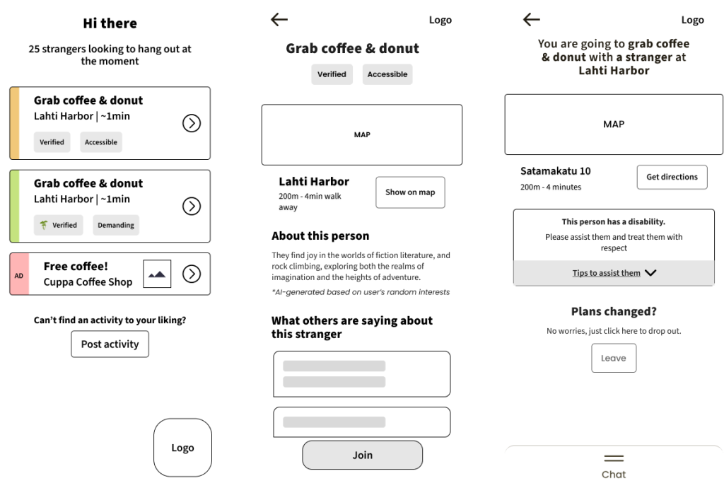
High-fidelity wireframe
Following the approved sketches, the layout was then made into a clean HiFi wireframe, which again was tested with the users and passed through the client, and changes made until everyone was happy with it.


Styles
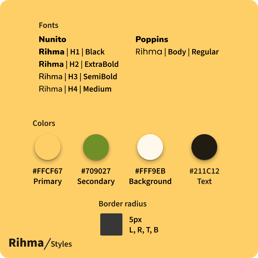
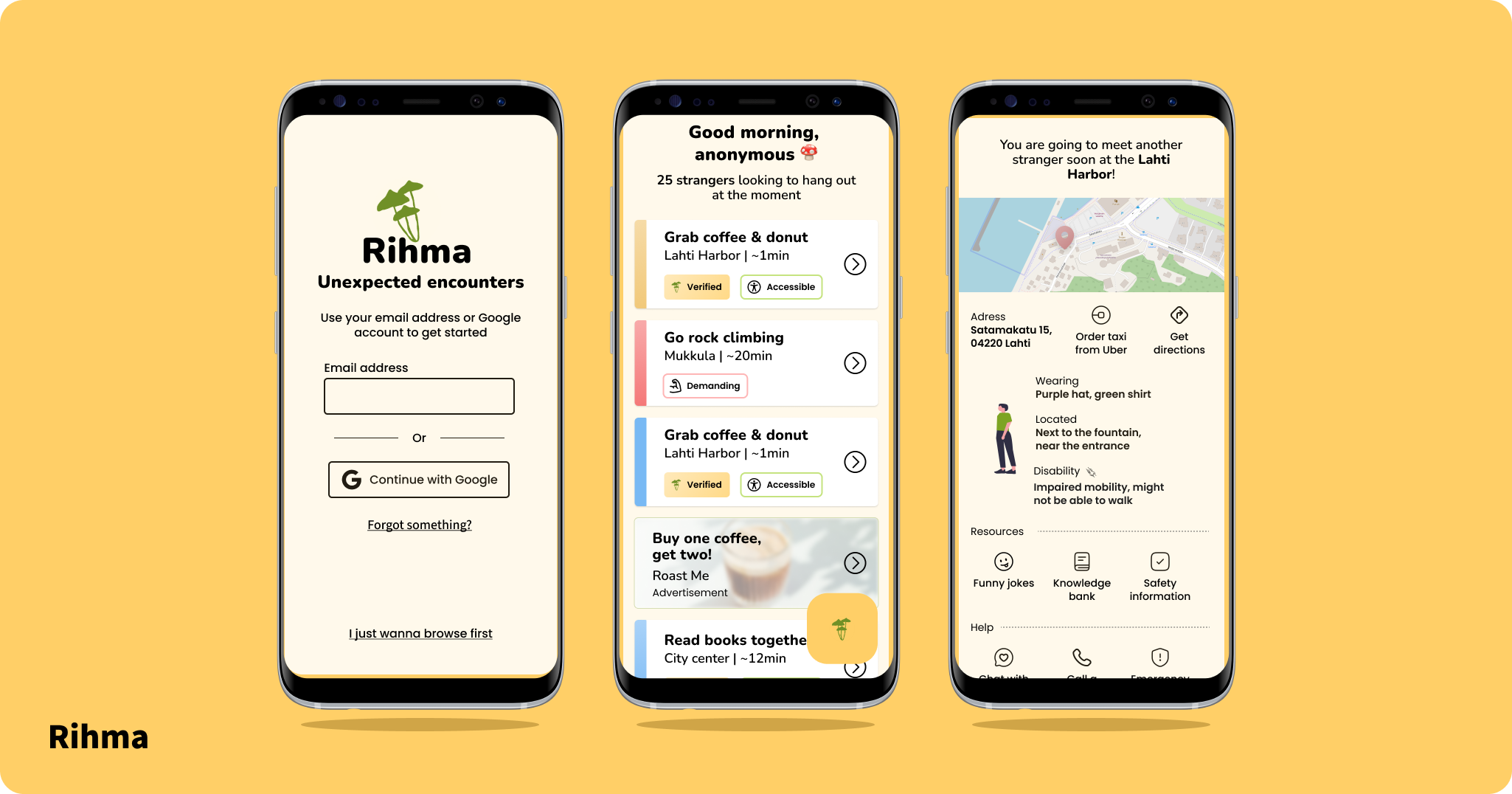
Together with the graphic designers, we designed a bright and fun color scheme, the main colors being yellow and green, representing sun and forest. The font choices, Poppins and Nunito in different weights, were also playful, yet readable. We wished for more organic shapes, but in the favor of minimalism, settled for a more geometric layout.
