ClarifUI
Equipping designers to consider cognitive accessibility.
Year
2023
Place
L’École de Design Nantes Atlantique, Nantes, France
Deliverables
- Web application
- UX Design
- UI Design
- Inclusive Design
- User Research
Project draft link
Enabling digital designers to consider invisible disabilities in their work.
Most commonly covered accessibility topics are related to vision only. Many designer’s knowledge of accessibility is thus limited to those, and unaware of the so-called “invisible disabilities”, they are unable to consider cognitive disabilities and overall brain-friendliness in their work.
My solution to raise awareness and to educate designers was a web-based tool, that analyzes the User Interface using AI, and gives actionable insights and practical information about the errors found.
Overview
“Cognitive accessibility, more commonly known as "brain-friendliness", serves everyone in certain situations. Whether we are situationally tired or anxious, temporarily feeling down, or impacted by a condition such as ADHD, we benefit from interfaces designed with the mind in mind.”
Thoughts on the project
Setting the tone
Issue
Awareness around digital accessibility is growing, largely dictated by legistlation in the EU. However, the guidelines tend to focus on the disabilities that visibly affect people’s functioning, such as vision and hearing impairment. In my deep dive into accessibility to find an issue to work with, I found “invisible disabilities” that are not yet getting the same amount of attention, and designers are widely unaware of them.
What are “invisible impairments”?
Shortly: there’s more than meets the eye in each person and their functioning. Conditions often hidden to others are often cognitive – that is, brain-related. These can be permanent, temporal or even situational. While autism might affect one’s interaction with the world for a lifetime, anyone can experience symptoms of sensory overload when e.g. anxious or stressed. Considering these can be called “cognitive accessbility”.
Market audit
Accessibility software market has been growing at a steady pace since 2020, and it’s Compound Annual Growth Rate (CAGR) is estimated at around 5.9%.
At 2020 the market was valued at $480 million, and after the post-pandemic rise in demand of accessibility software, the value reached $549 million in 2024. It is expected to keep growing, estimatedly passing the $800 million mark by 2030 and being valued at $875 million during 2031.
While the market is not the largest, new solutions in this field are greatly needed, and new regulations are expected to keep the market growing by increasing the demand by companies.

Getting to know the users
User Research was conducted to familiarize myself with the needs of the users. In this project, there were two user groups that needed to be considered: firstly, Group A: the direct users of the ClarifUI tool – the digital designers, and secondly Group B: those for whom the designers’ design, the end users impacted by cognitive impairments.
Designers to be studied were found from my Digital Design class (of course), professional networks, and different internet forums aimed at designers. Recruiting cognitively challenged users turned out to be difficult. I put up posts in several local Facebook groups in the local language, French, but they didn’t raise much interest.

Group A
Users of the tool itself:
mainly UX/UI Designers.
Their needs dictate how the tool is used.

Group B
End-users of services, impacted by cognitive challenges.
Their needs dictate what the tool does.
Casual chatting
Early in the design process I conducted an exploratory research with people with disabilities. The aim was to find out more about their lives and limitations with technology.
I ended up meeting with a middle-aged lady, struggling with a range of disabilities and cognitive challenges, at her home. Using unstructed interview as the research method, our meeting was more like a chat about all things accessibility. Another interview was done via online chat, since we couldn’t find a suitable time to meet face-to-face, and the person wasn’t comfortable with calling. She was also struggling with ADHD, and I interviewed her about her everyday life and struggles with technology.
These interviews were very insightful, and increased my empathy towards these people even more. Alongside literary review, these played a big role in coming up with the idea for ClarifUI.
Questioning designers
The survey sent to digital designers investigated their awareness of cognitive accessibility, what accessibility tools do they use in their work, how and where do they learn about accessibility, and what would help them address these issues better.
While the survey has decayed into the bit space of the internet, and thus I can’t make a pretty graph of the results, the resulting product speaks for itself!
Researching ADHDers
Another survey was sent to Group B: end-users with cognitive challenges. Due to the time limit it wasn’t possible to research the impacts of every cognitive challenge nor find users struggling with them. Thus I decided to focus on ADHD as one of the most common ones.
Based on respondant feedback and survey analytics, it appeared that I made the survey way too intensive. The original version was full of open-ended questions, and took more than 10 minutes to fill out. While the respondants liked the cat pictures I added after every few questions as progress rewards, the abandon rates were still high. Oh the irony of making a long, boring form for respondants struggling with attention.
I thus made a shorter, easier form, with multiple-choice questions instead of open ones, which got much more replies and better feedback from the respondants.
Interviews
At the end of the survey I asked respondants if they’d like to participate in a short interview via video call. Only a small percentage agreed, but I still got to interview three of them. Using a structured interview, I asked them about their technology use habits and what makes or breaks an user experience for them. This was a chance to ask any follow-up questions based on the survey, and get any relevant information regarding the design process.
Summary
From this research, combined with my own reading about the subject, it became evident that the responsibility for making products accessible and brain-friendly is on the designers. The Everyday Users said that they are powerless in front of these systems, and feel like they are not taken into account in the design process, while the majority of participating Designers expressed their unawareness of cognitive accessibility.
From here it became clear that the most impactful solution would focus on designers¹. Solving problems at their root.
¹Check-in with the real world
It’s idealistic to think that designers always have complete power over their design decisions. In large corporations, the opinions of the leadership and stakeholders, and conditions like budget and deadlines might prevent complete consideration of accessibility. However, I believe that designers can and should be bottom-to-top advocates for inclusive design and its benefits on business, too. This tool would significantly reduce time required for accessibility research and would help demystify cognitive accessibility.
Forming ideas
Based on all the data and understanding, ideas started emerging. From a simple educational game about web accessibility all the way to an AI-powered accessibility tool, I explored various approaches, before settling on one.
The original idea was a Figma plugin¹, that would analyze the project at hand, and offer feedback and suggest solutions for improving its brain-friendliness. Later this expanded into a web-based “standalone” tool, too. Designing for two very different medias/platforms simultaneously, as a single designer, proved extremely difficult, and certainly slowed down the advancements on the tool itself². This case study focuses on the web version, since it was taken further, and both of them are very similar.
Flowing through
User Flow for the scanning was kept simple. The user simply selects a file or URL as an input and then selects either Quick scan or Custom scan¹. Quick scan leads straight to tagging, while Custom scan takes the user to additional settings. Next, the user will tag the elements that the tool didn’t recognize. Finally, the user gets to inspect the results. This is, of course, a simplified flow representing the main steps of the process.

¹Quick Scan & Custom Scan
Quick scan uses default settings, while Custom scan is an “advanced” mode, where the user can tamper with the settings. The idea was to put Custom scan behind a paywall, but due to time constraints this idea was abandoned – for now.
²Tagging
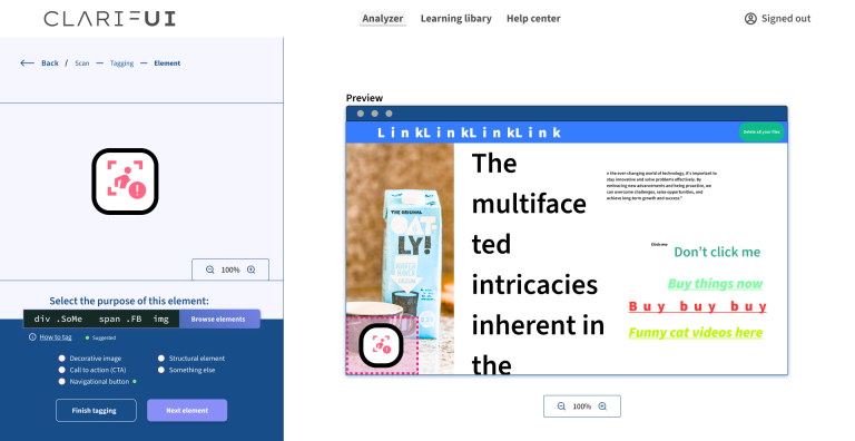
The tool tries its best to recognize every element’s purpose, but is only so smart. Thus the user might have to manually tell the tool what purpose does the element serve. For example, if someone used an image for a navigation bar (sacriligious), the tool would be confused, and user needs to clarify.
Sketching
Low-fidelity wireframing, or sketching, then combined all the knowledge and understanding into a plan for the User Interface. Since it also describes how the tool works, it resembles a blueprint.
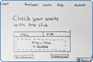
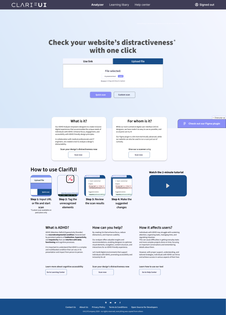
Front page is kept intentionally minimal, with just a headline, source input field (file or URL), and buttons for “Quick” and “Custom” scan. Further down on the page would be more information on the tool, and its operation.
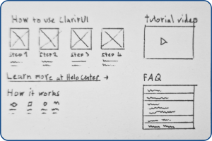
Information section includes simple, visual steps to get started with the tool, a video tutorial, and a Frequently Asked Questions element.
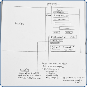
Inspect mode has a preview of the file or website, and the analysis results are found in the side panel. In the analysis results, the user can select the element to inspect, and then read through and apply AI-suggested changes to the issues detected by area. The areas include: Animation, Clarity, Color, Eye-tracking, and Text Content. Each issue is labeled by the corresponding guideline/section, with a link to further reading.
Styles
For the typography, I went safety first and picked a common, very readable sans-serif font, Source Sans 3(/Pro). This is the only font used in the design, varying in size and weight.
The colorscheme was kept minimal, without too bright colors. Light blue is commonly known as a calming color, so it was chosen for backgrounds, and a darker shade of blue/purple is used for the primary accent color. To reduce eye strain, I avoided combinations of pure white and black. Thus even the black color used has a blue tint to it. To avoid the red color being too alarming, a darker shade is used.
#f5f6ff
#90a1fd
#174d89
#945a73
#152a25
Source Sans 3 / Source Sans Pro
Aa
a b c d e f g h i j k l m n o p q r s t u v w x y z
End results
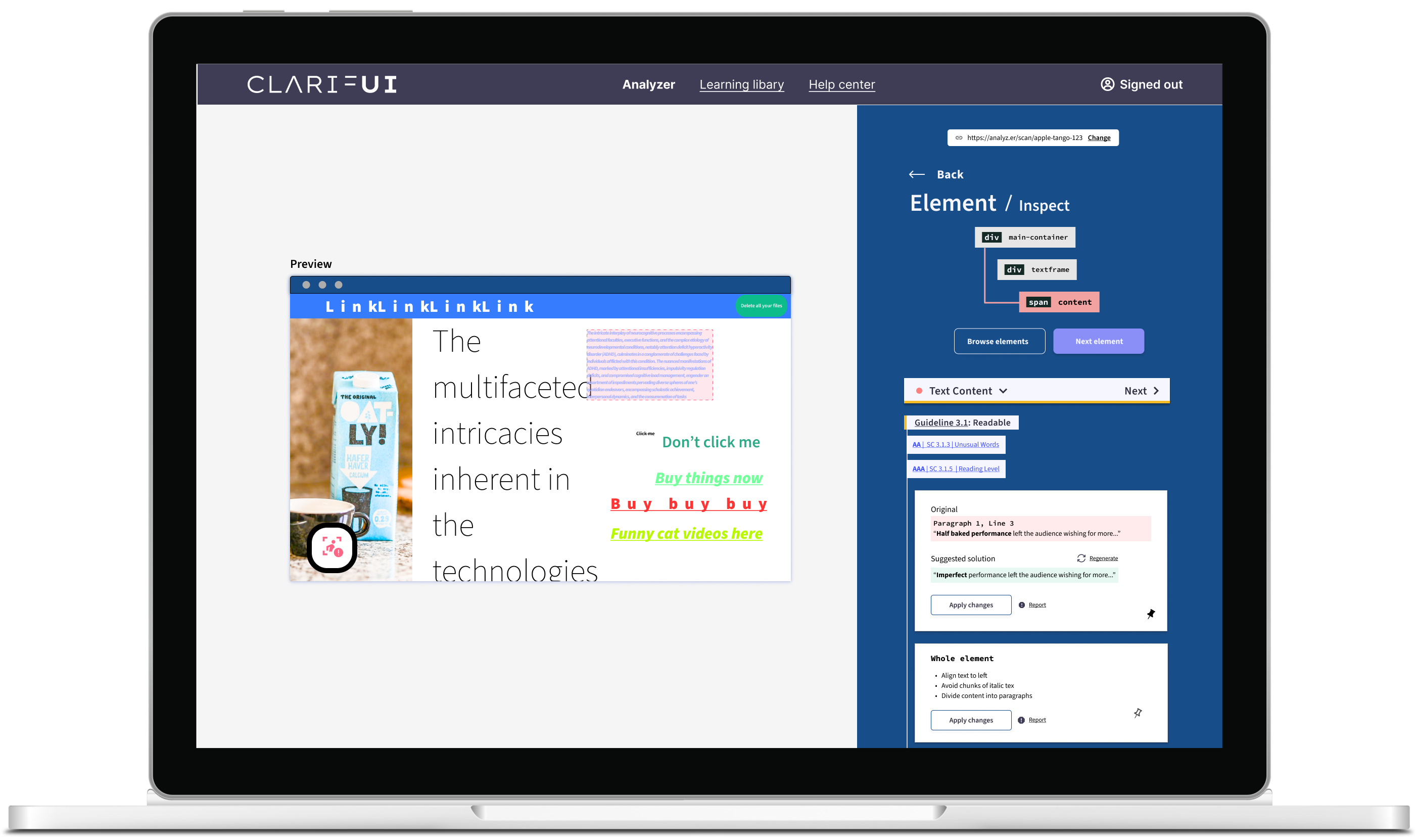
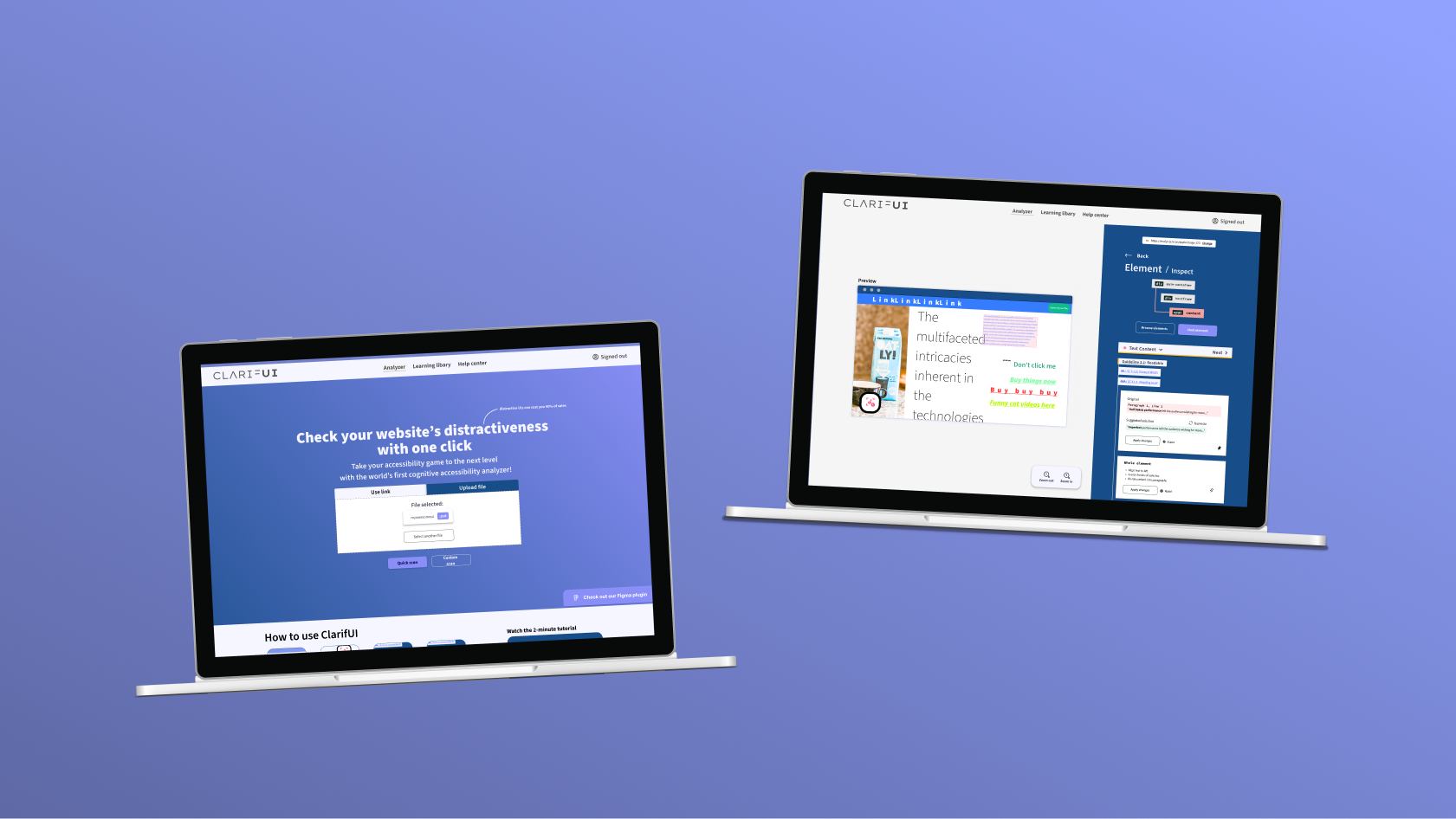
The final result is a visually appealing and logically sound, easy-to-use interface for the tool.
It allows the user to easily jump between the elements, or even change the source input on the go, if desired. The results are presented with a combination of tags and cards: each of them tells which guideline is being violated and how to fix it, and, hypothetically, the tool could make the changes for the user.
Front page
Tagging
The tagging phase is straightforward. The user sees a preview with the element to be tagged highlighted, and selects the appropriate tag for it in the sidepanel. User can also navigate between different elements to add or change their tags.
Scanning results
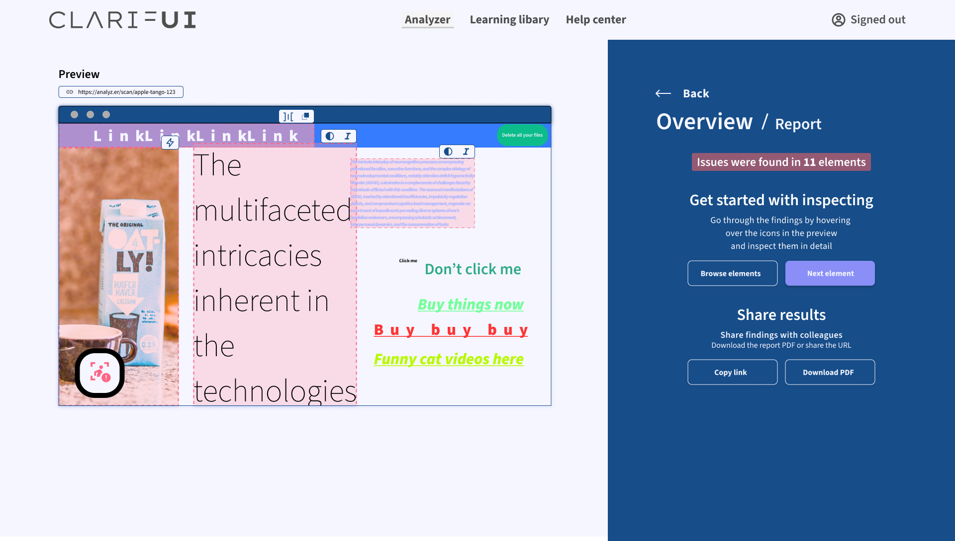
The Scanning Results phase is shown after the tagging and analysis is finished. Here the user can access the Inspection mode or share a report of the findings with their colleagues.
Accessibility checkup
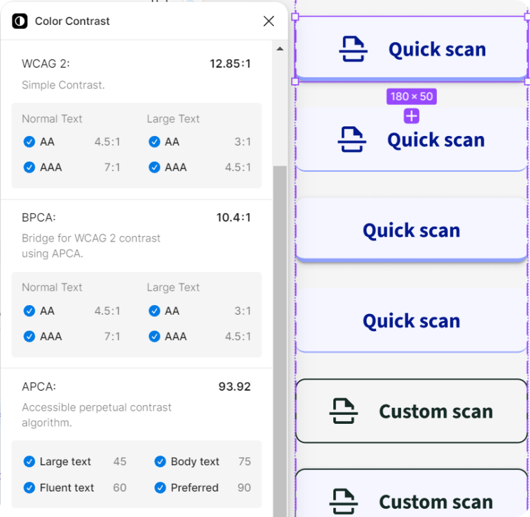
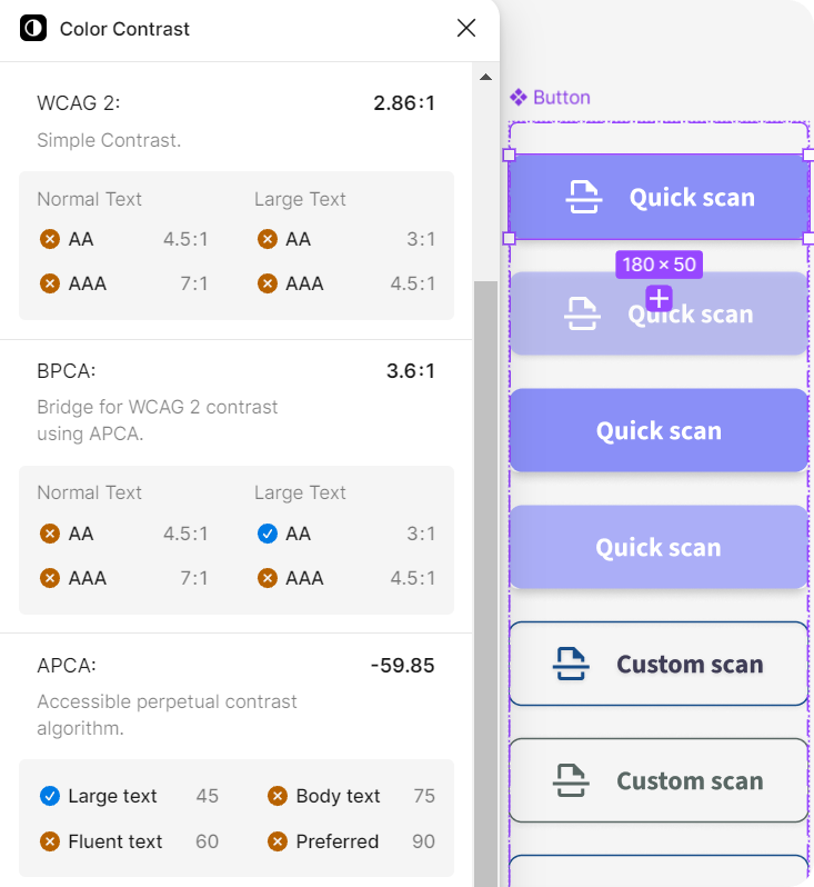
During the design process I fell victim to my own assumptions. The button’s color-combinations were chosen with contrast in mind, but it wasn’t only until later that I ran a contrast test – and it was far from accessible.
For checking the contrast I used the “Color Contrast” Figma plugin, which measures the contrast on several standards. Contrast guidelines of WCAG 2.x are said to be outddated, so an improved alternative, APCA, was used. More about color contrast magic here.
Thus, I quickly redesigned the buttons to comply with the magic contrast ratios. Although WCAG cannot be fully trusted, I made sure to comply with it, too, to be on the safe side.
This mistake reminded me of the importance of early-stage accessibility testing and not relying on one’s assumptions. It also inspired me to read more about color contrast in digital design, so something good also came out of it!
Before redesign
Looked good to my eye, but failed most of the contrast requirements.
After redesign
Still looks good, and now meets all the contrast requirements!
