ALT DMR
Making digital democracy accessible to everyone
Competition
Year
2024
Competition placement
#1 – First place 🎉
Place
L’École de Design Nantes Atlantique, Nantes, France
Deliverables
- UX Design
- UI Design
- Browser Extension Design
Enchancing contribution to digital democracy in Finland.
Finland is facing a dilemma: while the vast majority of citizens trust the democracy, very few actively participate in the decentralized decision-making. Sitra, the Finnish innovation fund, challenged our international team at Junction 2024 to find ways to encourage citizens’ participation to digital democracy.
Our solution distilled a complicated topic into a dead-simple interface, where democratic participation is as simple as a single mouse click. Utilizing Behavioral Design and User Research, I designed an easy-to-use browser extension, which was ideated together with my talented team of developers who made reality. Sitra’s jury loved our solution and we won the challenge!
Overview
“Cognitive accessibility, more commonly known as "brain-friendliness", serves everyone in certain situations. Whether we are situationally tired or anxious, temporarily feeling down, or impacted by a condition such as ADHD, we benefit from interfaces designed with the mind in mind.”
Thoughts on the project
Outlining the process
Issue
According to existing research around the topic, and our own user research there is a gap between knowledge and action. While the majority of respondents felt well-informed about their democractic contribution options, 91% of them had not participated in digital democracy.
A true democracy needs citizens’ participation. One of the tools Sitra plans to use is the open-source Pol.is platform, which our concept was inspired by.
Pol.is as a way of digital democracy engagement
While democracy has seen little innovations in the digital age, according to Sitra the public is interested in digital solutions for participation.
Social media is an endless well of opinions, but not a reliable one due to its polarization. Thus Sitra has been experimenting with the open-source Pol.is platform, that allows decision-makers to collect opinions more reliably by having citizens vote on current topics.
Familiarizing with the users
Brief quantitative User Research was performed in order to better understand the users. We made a short survey asking potential users about their democratic activity. Since we had less than 48 hours for the entire project, we had to cut some corners, and thus a more in-depth research was not possible.
Surve questions were:
- (Likert scale from 0 to 10): “How important is democracy to you personally?”
- (Yes/No): “Have you actively engaged in democratic action during 2024?”
- (Yes/No): “Have you actively engaged in democratic action using digital media during 2024?”
- (Yes/No): “Do you feel well-informed about democratic principles and practices?”
The survey shows that democracy is highly valued among the target group. While 42% of respondents actively participated in democratic actions in 2024, and 75% of respondents felt well-informed about democratic principles and practices, only 9% used digital media for that. This highlights the gap between knowledge and action.
In hindsight, I must confess, this research was unnecessary, since there are full demographic studies about citizens’ democratic activity – including one by Sitra, which we only discovered later. Qualitative research based on those studies could have been more fruitful.
Brainstorming
Our team discussed several platform options, before settling for a browser extension. We agreed that smartphone applications are overrepresented as solutions, and wanted to stand out from the crowd. People have so many apps already, that they are reluctant to install yet another one, we hypothesized. A browser extension was something unusual, both as a solution and for us to implement.
Low-fidelity wireframe
Low-fidelity wireframing, or sketching, then combined all the knowledge and understanding into a plan for the User Interface. Since it also describes how the tool works, it resembles a blueprint.
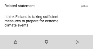
Initial state was designed to be as simple as possible. Democracy can be complicated, but we aimed to simplify it. Thus we distilled the first step down to just three elements: title, description, and voting buttons. The extension securely recognizes the content the user is reading, and shows a related statement from Pol.is. All it takes is just one click while browsing to participate in democracy. It couldn’t be more simple, and thus engaging!
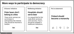
After voting on a statement, the user has already engaged with the content and is thus more likely to take further, more demanding actions such as signing an initiative. The post-vote state shows to types of cards:
- Initiative: displays a related initiative from various trusted sources, a short description of it, and a link to read more and eventually sign it
- Pol.is statement: same as in the initial state – collects users opinions by prompting voting on related statements
Design decisions
Initial state was designed to be as simple as possible. Democracy can be complicated, but we aimed to simplify it. Thus we distilled the first step down to just three elements: title, description, and voting buttons. The extension securely recognizes the content the user is reading, and shows a related statement from Pol.is. All it takes is just one click while browsing to participate in democracy. It couldn’t be more simple, and thus engaging!
- Minimal Interaction Cost: Interaction Cost, meaning how much thought and effort an action requires, was meaningfully kept to minimum, following the laws of PLE
- Principle of Least Effort (PLE): users don’t like effort, but after getting started they are more likely to carry on to more effortful actions. Thus we made the initial state extremely simple, and only after interacting with that is the user revealed more “advanced” options
- Progressive Disclosure: Saves the more complicated options for later, once the user has already reached some momentum
- Preventing bias: AI can be biased, and our job was to eliminate the echo chambers of social media, not create another one. After the user has voted on the initial statement, the AI knows their stance on the topic (agree or disagree) and can offer initiatives that reflect their opinion (for example: not showing anti-cat initiatives to a pro-cat user)
- In a nutshell: it’s simple – very simple!
Styles
Since it was Sitra’s challenge, and hypothetically they would publish the tool, I decided to mimic their branding – bold and modern. This is not only visually interesting and youthful, yet delicate enough for older age groups, also highly accessible style.
The colorscheme is straight from Sitra’s branding, using black and bright yellow. I decided to stick to just these two colors (+ white) without shades. This simple tool uses simple colors.
#174d89
#FFE438
#ffffff
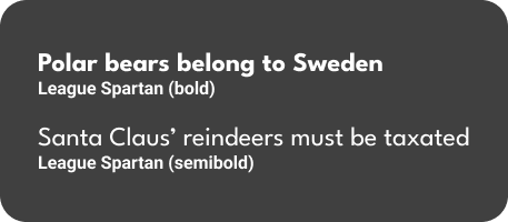
For the typography, I decided to use League Spartan, for it’s bold and modern look, and similarity to Sitra’s brand font.
End results

The final design closely wraps the intuitive User Experience frame into Sitra’s striking visual style, creating an easy-to-use and eye-catching browser extension. There is nothing extra, and thus it remains simple. It is the simplicity and usability, among the “cool-as-heck” code by my talented team, that were mentioned by the jury after selecting us as the winner.
However, simplicity doesn’t necessary mean its functions are simple – as demonstrated before, it cleverly (although I say so myself) considers psychological principles to minimize the users’ cognitive load and effectively engage them into doing something complicated very easily.
Further User Testing is required however, in order to make sure it matches the users’ needs. We were also planning on adding in gamification, but decided to make Sitra dependant on us by not providing them everything just yet 😎
Note: the User Interface didn’t get fully implemented during the hackathon due to time contrainsts. This is how it should look rather than how it looked in the hackathon submission!
Front page

Accessibility considerations


In addition to ensuring a strong color contrast and a logical visual hierachy, there was one major issue that appeared simple at first: the icons by themselves could be ambigous. Icons such as “thumbs up” and “thumbs down” are widely recognized, but due to their usage in a variety of contexts, their meanings can be misinterpreted.
A common meaning for the “thumb” icons is “like” or “dislike”, which could really change the meaning in this context. Let’s say the statement would read “Hot dogs are should be provided at elementary school lunch”. If the user simply likes hot dogs or wants to see more statements like it, they could press the “thumbs up” icon, which they think stands for “like”. One can like something without agreeing on it. Having everyone wear pink socks on Valentine’s day might be a fun idea worth “liking”, but to “agree” on something as unpractical is different.
Further discussion
AI safety & user trust
A relevant and very current question is, “what would make users trust an AI system?”. We thought about this, and decided to make it as unobvious as possible. Our coders made the system as secure as possible, since it’s continously observing users’ online behavior, and no-one wants that if there’s a danger of it leaking. The question of how to inform the user about this effectively, remains.
As mentioned before, we took steps to reduce the chance of showing the user wrong content (of the opposing view) by having a voting system (agree/disagree/pass) as a filter of the user’s opinions on the matter. The AI could also train itself (locally) on this information, to further prevent displaying wrong content, or to present better options if the user sometimes clicks “Pass”.
